More Projects

Sea creatures evolve into crabs, databases evolve into DynamoDB

Animals in the Ocean Evolve into Crabs

In evolutionary biology there’s a concept called “carcinization”. Put simply, there is a trend towards different crustacean species evolving to have crab-like bodies, even if they started out more like a shrimp or lobster. Over time, given the advantages of a crab-like body, they flatten out, tuck their tail, and in just a few million years you have an animal that looks like a crab but started out quite differently.

A bunch of crab-like crustaceans that aren't actually crabs These aren’t actually crabs

I’ve observed that the same thing tends to happen with companies’ database infrastructure. No matter where you start out, be it a transactional relational DB or otherwise, the pressures and requirements of scaling for load and organizational complexity inevitably form the resulting system into… DynamoDB. The result might not actually be DynamoDB, but it’ll at least look like it. In fact it will look so much like it that you probably should have just used DynamoDB in the first place.

*I’d read this*

Databases in a Growing Company Evolve into DynamoDB

What does it look like for database infrastructure to evolve into DynamoDB? Like any evolutionary process, it starts slowly as the pressure builds. Often when your team is just getting started, they reach for the tried and true solution for their database, or at least whatever’s trendy at the moment. Let’s assume it’s PostgreSQL, which is somehow both right now.

The team jams away building their product with little oversight on the different ways the database is being used. And yes, it’s almost always just one database at this point—who wants to maintain multiple databases, after all? As the product grows, so does the database, sprouting new tables, new indexes, and above all getting filled with more and more data.

As the growth continues, there will be warning signs. Queries that used to be lightning fast are getting slower and slower. Even inserts are slowing down as index updates and constraint checking takes longer. Your product experiences more and more outages as the database locks up “randomly”, sometimes because one customer “did too much at once” and it affected everyone else. Sometimes it’s because some developer made a change that had unintended consequences, or updated the schema and locked an entire table. Minor features start having a negative impact on core flows: your chat system gets slower and more fragile because the table of reaction emojis got too large.

A graph showing exponential growth and the international pain scale faces on them, from "No Pain" at low usage to "Worst Pain Possible" at maximum usage Point to where you are on this chart right now

Most companies respond to this by building out a dedicated “database infrastructure” team. These are the heroes who are tasked with keeping The Database running, and it’s the most brutal on-call rotation in the company. And if that wasn’t bad enough, life gets harder for the rest of the company. Product teams move slower now that their changes have to go through more checks and process gates, but at least outages are somewhat fewer and further between.

The growth doesn’t stop though (which is good for business!) The database infra team starts to raise the alarm: they’re already running on the biggest database instance your cloud provider has to offer. The slider can’t be pulled any further to the right, and no amount of money can buy your way out of the problem. The application has to change.

A list of instance types, ending with the db.x2g.16xlarge instance type 
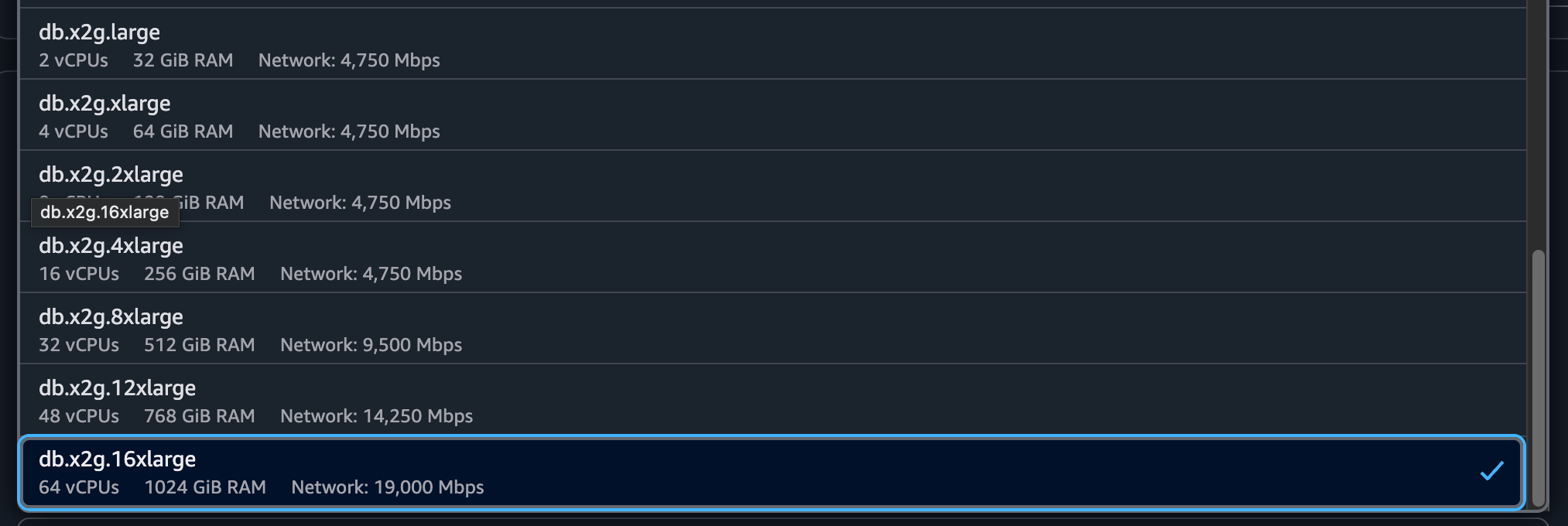
The RDS instance dropdown doesn’t have anything more after this

So if you can’t scale up anymore, what do you do?

Making Headroom

Once a team has exhausted their ability to vertically scale, the options for buying time look pretty much the same for everyone:

  1. Add caching or read replicas. This can buy headroom on a database that’s getting CPU constrained by bleeding off a lot of the read traffic. The downside is a lot of extra infrastructure to manage. Plus, now you have to deal with either stale data (with an eventually-consistent cache) or slower, more fragile writes (with a strongly consistent read replica). There will be temporary relief in your CPU graph as the traffic reduces, but the database infra team has more to manage, the product has gained a bunch of subtle bugs, and continuous growth will eat up all the gains you made.
  2. Split out tables into new databases. Does everything need to be in one database? Maybe not, but good luck getting things out of there. This is always difficult because you have to choose what goes and what stays. To do that, you need to know all your queries that involve the tables you want to move, and inevitably you’ll be faced with having to break some of those queries. No matter what it’s going to take a lot of development effort to get the database’s consumers to move over, and product teams will ship less while they’re focused on migrating. What’s worse is that the data that’s hardest to move out of your main database tends to be the most critical data, which is usually the data that’s causing scaling problems in the first place.
  3. Optimize queries and data storage. Some folks think they can optimize their way out of the problem, and you’ll definitely find some shockingly inefficient queries and bloated tables to get rid of. But these wins are temporary as new inefficient queries and bloated tables keep getting added, and usage keeps going up.

In the end, none of these solve the core problem: you’re trying to contain unbounded growth within a box (server) that cannot grow unbounded. Every company will either hit this point, or stagnate, or die.

Evolving claws and a flat body

There’s only one real option to contain unbounded growth: partition the data itself, and horizontally scale. After a few years of the database infrastructure team furiously patching the dam, they all must come to the conclusion that the only way to continue scaling is to expand the database beyond a single machine. While it’s inevitable, it isn’t easy. Lots of teams will look back at their history and make a critical mistake: “We’ve come this far with our favorite database technology, we can adapt it to be horizontally partitioned.”

The most senior engineers in the database infrastructure team will draw up a plan: each table will be partitioned by some natural key, and that will be used to distribute the data across many machines. Some sort of proxy service will be introduced that takes queries and routes them to the correct partition. Complex systems will be employed to determine how many partitions there are and which one holds a particular key, and those systems will grow more complex to handle adding new partitions over time. You’ve heard this story before, because it happens all the time.

A diagram of a partitioning proxy that dispatches to multiple DB partitions More or less this, every time

There will inevitably be casualties switching over to this new proxy. SQL is a very complex language that can join between many different tables that could each have a different partitioning strategy. Most of the teams building these proxies will not want to sign up for the task of building a general-purpose query planner, so they’ll restrict the kind of queries it accepts to be a small subset of queries that include the partition key in them.

Other things get far more difficult in this partitioned world. Transactions between partitions are right out. Updates to schemas are now so difficult that they are generally avoided, since they need to be coordinated across all partitions. The lack of ability to change schema, plus the reduced query capabilities from the proxy layer, leads teams to drastically simplify their schema. Usually they end up with tables that look like a partition key, a couple secondary ordering keys, and a big JSON blob of data.

What does that sound like?

What the team has built is:

  1. An inherently partitioned database, with records automatically spread across machines, and the ability to add new partitions as you scale up.
  2. A vastly simplified query system that only really works on a single partition key at a time.
  3. Storage for generic JSON documents instead of strict schemas in column-oriented tables.
  4. Limited support for transactions if they have them at all.

And what they’ve gained is:

  1. The ability to scale infinitely by continuing to add more partitions.
  2. Consistent performance regardless of how much data is stored and how many queries are served, assuming partition size is kept constant.

That’s a pretty good description of DynamoDB! Of course, in our story the team has painstakingly arrived at this point by themselves, and now have complex infrastructure to develop and maintain on their own, while DynamoDB is a hosted AWS service with zero operational overhead (it’s all AWS’ job to run it). At least they get to write a cool blog post about it.

This pattern is far from exclusive to DynamoDB. Others like Cassandra, FoundationDB or ScyllaDB are very similar. But none of them are run by a huge cloud provider on your behalf.

It has happened before, and it will happen again

None of this is theoretical. It’s a pattern we’ve observed happening over and over again at growing companies. When we worked at Amazon, we were part of the teams that went through the first steps of this story, trying to keep a couple huge Oracle databases alive until DynamoDB was invented and all Tier 1 services were migrated away from relational DBs. Facebook went through the same story with MySQL. YouTube famously built Vitess to partition MySQL. Even younger companies like Figma, Canva, and Notion have gone through similar journeys.

A screenshot from Canva's presentation at AWS, showing database "magic": Removed all foreign keys, denormalized the schema, change columns to JSON text Canva migrated from RDS to DynamoDB via the same process we talked about here

People who have lived through this tend to favor DynamoDB or its look-alikes when starting new projects, and they advocate for it whenever things start to get hairy. If you haven’t gotten to experience this first-hand, maybe ask yourself whether or not you expect your product to keep growing, and if you do, whether you can see your team going down the same path as so many others. And maybe you’ll reach for something that can keep up with that growth.

This was originally published on the Stately Cloud blog on July 19, 2025: Sea creatures evolve into crabs, databases evolve into DynamoDB.

The Safari bug that punishes you for using content blockers

,

Running content blockers in your browser is a good idea–yes, you block ads, but you also block malware, cryptominers, tracking, and more. In general, the experience of using the web with a good content blocker should be noticeably faster, as you skip downloading and executing many megabytes of code, images, and videos that provides you with no benefit. I’ve run content blocking extensions since they were first introduced and I’ve never looked back.

Safari 15, released in September 2021, was the first version to support extensions, including content blocking extensions. This was a huge improvement to mobile browsing on iOS, which doesn’t offer any choice of browser besides Safari. Safari finally had a way to fight back against intrusive ads just like other browsers. I chose to use 1Blocker, which was highly reviewed by Apple aficionados at the time, though I’m sure there are other good alternatives.

How Content Blockers Work

The earlier content blockers used Firefox’s Addons or Chrome’s Extensions spec to intercept web requests. Each request first had to pass through a bit of JavaScript in the extension to see if it would be allowed or not. This enables extremely powerful blocking based not just on lists of “bad” URLs–the extension has the chance to block based on all kinds of complex heuristics.

There two big problems with this approach. First, and most importantly, you have to trust these extensions. Since they get to run whatever JavaScript they want, they can also smuggle your browsing history off to a third party, turning what should be a privacy improvement into a privacy disaster. I don’t know that the reputable extensions ever had problems with this, but I’m sure that many extensions were siphoning off all their user’s browser history. The second issue is that, since the extension runs any JavaScript it wants, in the path of loading any request, it could be a performance (and in turn, battery) problem. Inefficient code could slow down browsing.

As a replacement, Google and Apple both switched to a much more constrained blocking API, which is pretty much just a denylist. Instead of intercepting every request and running arbitrary JavaScript, extensions can only register a list of regular expressions for things to block, and the browser evaluates whether a request matches anything on the list. This is strictly less powerful than the old API, but it does not offer any opportunity for extensions to spy on users.

Unfortunately, the developers of Safari made a mistake in implementing these declarative filters (or made a conscious decision based on tradeoffs that are not immediately clear to me).

How Other Browsers Check Content Blocker Rules

It is extremely common these days to render all or part of a web page using JavaScript in the user’s browser. That means that code on the page is inserting DOM nodes that refer to images, videos, scripts, stylesheets, etc.

In browsers like Chrome and Firefox, the process works a bit like this:

In Chrome and Firefox the blocking task is short, and content blockers are consulted in the background while loading images.

Some JavaScript code inserts a DOM node, say an IMG node, and sets its src attribute. The browser goes to fetch the image itself from the network, and in the background (off the main thread that runs the interactive UI) it does everything needed to load the image–checking the cache, resolving DNS, establishing a connection, downloading the file, and so on. And before it does any of that, it checks the content blocking rules to see if it should be allowed to load the file at all. This check also happens in the background as part of fulfilling the network request. So the DOM node is inserted, it is in a “not yet loaded” state, the browser attempts to fetch the resource in the background, it gets blocked by the content blocking rules. The image fails to load. Same thing for scripts or videos or anything else.

How Safari Checks Rules

Safari, as far as I can tell, does this very differently. When some JavaScript code inserts an IMG node, Safari blocks the main thread to check and see if the image’s source is blocked by the content blocking rules. It performs the content blocking check right then and there when you call insertNode, before anything else can happen. Then, after that check is done, JavaScript can continue running. Like with other browsers, the actual network request (cache, DNS, connection, download) happens on the background.

In Safari the blocking task is long, because it consults content blockers every time an image node is added.

These checks add up when you have very large lists of content blocking rules–and every content blocker extension has a ton of rules. 1Blocker has over 100,000 rules broken up over several different lists. No matter how much you optimize the process for matching against these lists, it takes time to go through them all for every request. That’s true for any browser, but Safari is the only one that blocks the main thread while doing the check. The result is noticeably slower websites, that are not interactive while loading these resources–you can’t scroll, you can’t click, nothing happens until the content blocker rules have been checked. Chrome and Firefox users are certainly loading their images a bit slower because of blocking rules, but they do so in parallel, while the page continues to work. Safari checks each resource one by one, on the same thread that’s supposed to be doing all the other work on the page.

We can demonstrate this easily. I’ve written a small demo app that does so. Open that up, hit the “Do it” button, and it’ll use JavaScript to insert a few hundred images into the DOM. On Chrome or Firefox, even with content blockers enabled, the DOM nodes are inserted in a few milliseconds (on my powerful laptop it takes 2ms). However, open this up in Safari with a content blocker like 1Blocker enabled, and it takes over a second–on my M1 Max CPU it takes 1230ms, or 600 times as long as on Chrome. That’s almost 2.5ms per image.

What does this mean? Not many websites load 500 images in a single loop, so you’re probably not seeing these page-pausing latencies that often. But 2.5ms per image adds up. How many sites load 10 images at once? 100? At that point you’re already up to a quarter second, which is a noticeable hitch. This bug is effectively punishing you for running a content blocker by adding a little pause here, a little pause there. And if a site loads a lot of images at once (say, a bunch of photo thumbnails) you might really feel it.

I’ve filed this bug to track the issue. This bug has existed for over three years, and it’s been over a year since I filed the issue, and as of Safari 18.1 there’s no improvement. It’s worth calling out that my explanation above is an assumption of what’s happening based on what I’m seeing–I’ve tried to read through the WebKit sources to find where it’s checking content blockers, but I don’t know the codebase and my searches haven’t come up with conclusive proof. If you know how these actually work, and can point me to the code, I’d be grateful and will update the post. In the meantime, be aware that your browsing and web apps on Safari run slower because you’re using a content blocker.

P.S.: In DIM, I ended up having to work around this by not inserting images until they’re on-screen (using an IntersectionObserver), but that’s not a workaround I’m happy to have to use everywhere I display a lot of images.

Casting the Apple of Eden from bronze

Early in August, my partner, Eva Funderburgh texted me from her bronze casting class:

Hey! I’m one of only two people in the class. I get as many investments as I want. Can you come up with a good plan to make an apple of Eden model by the time I’m home?

Until recently, I’ve been a big fan of the Assassin’s Creed series of video games, especially since it intersects with my interests in parkour and climbing, history, and science fiction. One of the key artifacts in the games’ fiction is the Apple of Eden, an ancient piece of technology that gives its owner magical powers and the ability to influence people’s minds. The plot of the games often focuses on finding or controlling these artifacts.

My partner had been branching out from ceramic sculpture to bronze casting, and we’d talked a bit about making a replica prop of the Apple out of bronze, but I never wanted to take up space and materials that she could use for her actual art. But now we had the opportunity, and better yet, a deadline. Within a week, we needed to have the wax form of the Apple built and ready.

The Apple of Eden

While I don’t build replica props myself (with the exception of this project), I enjoy reading Harrison Krix’s exhaustive build logs for the amazing props he builds. The rest of this article will detail how we designed and built a life-sized, illuminated replica of the Apple of Eden cast in bronze.

The first task was to actually design the Apple. We knew it needed to be a sphere, and from game screenshots we figured out a rough size based on how it looked in characters’ hands. More troublesome was the pattern on the surface of the sphere, which was hard to pick out from screenshots, and which was not consistent from shot to shot. We ended up designing our own pattern of channels inspired by the common patterns from screenshots and fan art.

Apple of Eden research

To start with, we needed a hollow wax sphere. In lost wax casting, a wax form gets encased in plaster and then melted out, and bronze is poured into the holes that are left behind. To get a good sphere shape, we made a plaster mold from a cheap toy ball that was already the right size.

Iron Man ball

First, half of the ball was covered in clay to make a “rim” for the plaster to form up against, and then we mixed up a batch of plaster and slopped it onto one side of the ball with our hands. As long as the interior surface is nice, it doesn’t matter what the outside looks like.

Eva with the bottom half of the mold

Plaster hardens in minutes, after which we removed the clay. The clay had some registration keys (little dots) in it so that it would be easy to pair up the two halves of the plaster mold again. A bit of clay was used to preserve the pour spout so we could pour wax into the finished mold.

Bottom half of the mold

Adding plaster for the top half

Once the mold was finished, we heated up casting wax in an old crock pot, and poured the wax into the mold. By pouring in wax multiple times and sloshing it around, we were able to get a mostly even shell of wax with a nice spherical outside. It was important to make sure the shell was still thick enough that I could carve the decorative channels in it without breaking through. We cast a few wax spheres so that we could experiment with different designs and carving techniques.

Heating wax

The channels were first drawn lightly on the wax, then carved in using a clay-working tool that has a looped blade at the end. I tried to make the depth nice and consistent, but this was all freehand. I didn’t mind a bit of variation because I wanted this to look like an ancient, handmade artifact rather than a machined, perfect piece. The pour spout was widened to provide a hole to stuff electronics into. Eva turned a cover for the hole on her potter’s wheel directly out of a bit of wax.

Carving the channels

At this point the wax looked generally good, but it had a lot of little nicks and scratches and even fingerprints from where I was working with it. Eva wiped the surface with turpentine, which smoothed out the surface quite a bit.

Smoothed with turpentine

Once we were happy with the shape, Eva sprued the wax onto a sprue system that she was sharing with a bunch of other small pieces. Where many artists would make a single piece at a time, Eva makes complicated sprues of many small pieces, because her art is generally on the small side. The sprue system provided channels for the bronze to flow to the piece, and for air to escape as the bronze flowed through all the spaces. Eva had to build a complex system of large inlet paths with many small outlets, being careful to make sure that there was always a vent at the highest point in the piece, so that air bubbles wouldn’t get trapped. Finally, bronze pins were inserted at points around the sphere so that the plaster in the middle wouldn’t just drop when all the wax was melted out.

Sprue system

Then, we moved to Pratt Fine Arts Center, and all the sprued pieces were placed in cylinders made of tar paper and chicken wire, and filled with a mixture of sand and plaster. The sprue system was shaken a bit to get rid of bubbles and make sure the plaster got into every corner. The plaster cylinders, called “investments”, were then moved into a large kiln, upside down, and heated to 1200°F to melt out all the wax and burn out any other organic material (like the toothpicks used in the sprue system).

Investing the wax

We returned a week later for the bronze pour. We helped dig out the sand pit, and half-buried the investments in sand to contain any bronze in case they split open. Once the bronze had melted in the crucible, it was lifted up by a crane, and Eva helped pour the liquid bronze from the crucible into the pour holes in the investment. This video shows the process much more clearly:

Play Video: Casting the Apple of Eden in Bronze

The bronze inside the plaster investments cooled off in about a half hour, and we were able to take axes and hammers to the plaster to free the bronze within. After the pieces were separated from the plaster, they were pressure-washed to get rid of more plaster. The bronze looked super crufty at this point because of oxidation on the surface, and flashing and bubbles that had stayed in the investment and got picked up by the bronze.

Freed fro the investment

Taking the bronze home, we separated the pieces from the sprues using a cutting wheel on a die grinder or a hacksaw. The extra bronze from the sprue gets recycled for the next pour.

Cutting off the sprue

The bubbles were popped off with a small chisel, and then Eva went over the surface with a coarse ScotchBrite pad on her die grinder to smooth off the surface. She then took another pass with a fine ScotchBrite pad, and finished with a wire brush. The transformation is remarkable - at this point the Apple was glowing, bright metallic bronze.

Polished

However, we didn’t want an Apple that looked brand new (or looked like shiny metal). This is supposed to be an ancient artifact, and fortunately there’s an entire world of bronze patinas that can be used to transform bronze surfaces with different colors and patterns. First, we tried applying a liver of sulfur and ferric nitrate patina, brushing on the solution while heating the surface of the bronze with a blowtorch. Unfortunately, there was a bit too much ferric nitrate, and a bit too much heat. The effect this produced was striking, with metallic, iridescent splatters forming over the smoother parts of the Apple, and a dark red patina for the rest.

First patina

As cool as this patina looked, it wasn’t exactly what we were looking for, but one of the nice things about bronze is that you can always just remove the patina and start over. Eva scrubbed off this patina with a wire brush, and tried again, this time with less ferric nitrate and going lighter on the blow torch. Despite using the same process, the result was very different - a dark, aged bronze that was perfect for the Apple. Eva sprayed on some Permalac to seal in the patina.

Second patina

One feature I was particularly excited about was lighting. The Apple glows along its surface channels, and I planned on using EL wire to provide this effect. EL wire glows uniformly along its length, uses very little power, and looks very bright in low light. First, Eva polished the inside of the channels with a wire brush to provide a bright reflection of the wire. Then, I worked out how to take the EL wire I had bought and work it into all the channels in a single continuous line with a minimum of overlap. This required drilling holes in strategic intersections and running some of the wire internal to the sphere. We tried some different options for attaching the wire, like silicone caulk with glow-in-the-dark powder mixed into it, but in the end it looked best to just superglue the wire into the channels. The battery pack and transformer fit snugly inside the sphere and connected to one end of the glowing wire.

Planning EL wire

The last bit to figure out was the cap. Since it was cast from bronze, it was hard to make it mate up with the hole in the sphere perfectly, so we hadn’t bothered. We bridged the gap by heating up some Shapelock plastic, forming it around the base of the cap, and then pressing it into the hole. We trimmed all the excess plastic so it wasn’t visible. Once the Shapelock cooled, it formed a perfectly fitting seal that allowed us to press the cap onto the sphere and it would stay put unless pried off with fingernails.

We really had two deadlines – the first was the bronze pour, but we also wanted to have the Apple finished in time for PAX, a big gaming convention that’s held every year in Seattle. We didn’t have time for full Assassin’s Creed costumes, so instead we carried the Apple around the show and took pictures of other video game characters holding the Apple. Oddly, we didn’t find any Assassin’s Creed cosplayers.

Joffrey with the Apple

I’m really glad that we got the opportunity to work on this fun and nerdy project. The Apple sits on my mantle now, and it’s fun to light up and hold – there’s no substitute for the weight and feel of real metal. I plan to bring the Apple with me to PAX again next year.

You can view all the progress photos and PAX photos on Flickr.

Front of the Apple Side of the Apple Back of the Apple Back, lit

Maruku is obsolete

, ,

A few weeks ago I finally released Maruku 0.7.0 after a short beta that revealed no serious issues. This was the first release in four years of the venerable Ruby Markdown library. I inherited Maruku over a year ago and I’m very proud of the work I’ve put into it during that year. I’m glad that I was able to fix many of its bugs and update it to work in a modern Ruby environment. However, I want to recommend that, if you have a choice, you should choose a different Markdown library instead of Maruku.

When Natalie Weizenbaum handed Maruku over to me, my interest in the library stemmed from its use in Middleman, and my desire to default to a pure-Ruby Markdown processor in the name of compatibility and ease of installation. The two options were Maruku and Kramdown. Maruku was the default Markdown engine for the popular Jekyll site generator, but was old and unmaintained. It also used the problematic GPLv2 license, which made its use from non-GPL projects questionable. Kramdown was inarguably a better written library, with active maintenance, but under the even-more-problematic GPLv3 license. The GPLv3 is outright forbidden in many corporate environments because of its tricky patent licensing clauses, plus it has all the issues of GPLv2 on top. I emailed Thomas Leitner, Kramdown’s maintainer, about changing the license to a more permissive license like the MIT license (used widely in the Ruby community) but he declined to change it, so I set to work on Maruku.

As I explained in my initial blog post, my plan was to fix up Maruku’s bugs and relicense it under the MIT license and release that as version 0.7.0. I did that, and then the plan was to release 1.0.0:

I’m thinking about a new API and internals that are much more friendly to extension and customization, deprecating odd features and moving most everything but the core Markdown-to-HTML bits into separate libraries that plug in to Maruku, and general non-backwards-compatible overhauls. […] Overall, my goal for Maruku is to make it the default Markdown engine for Ruby, with a focus on compatibility (across platforms, Rubies, and with other Markdown interpreters), extensibility, and ease of contribution.

However, in March of 2013, Mr. Leitner decided to relicense Kramdown under the MIT license starting with version 1.0.0. I continued to work on finishing Maruku 0.7.0, but I knew then that for people looking for a capable, flexible, well-written pure-Ruby Markdown library, Kramdown was now the correct choice. All of the things I wanted to do in Maruku for 1.0.0 were in fact already done in Kramdown – better code organization, better modularity and extensibility, good documentation, a better parser, and improved performance. Soon after Kramdown 1.0.0 was released, I switched Middleman to depend on it instead of Maruku.

I will continue to maintain Maruku and make bugfixes, because it’s the right thing to do. That said, I’m not sure I can justify doing much work on the 1.0.0 milestone knowing that, given the choice, I would use Kramdown or Redcarpet over Maruku. My recommendation to the Ruby community, and Ruby library authors, is the same: use a different Markdown library, or better yet abstract away the choice via Tilt. Please feel free to continue to send pull requests and issues to the Maruku repository, I’ll still be there.

Redesigning evafunderburgh.com

My partner Eva Funderburgh is a professional artist, and has been making sculptures full-time since we both moved to Seattle in 2005. I don’t have much talent for clay, so my main contribution is to help with her website. A few weeks ago we launched the third iteration of her site, which we’d been working on for several months.

Old site

The previous version (shown above) was launched around 2008 and was basically just a Wordpress theme. Eva had hand-drawn some creatures and wiggly borders to make it all feel less digital, but there’s only so far you could go with that on a web page. The resulting site had a lot of character, but ultimately failed to put her gorgeous art front and center. Worse, it had failed to keep up with the increasing sophistication and complexity of her work. It also scaled poorly to mobile devices, and just plain looked outdated.

I had a lot of goals for the new site. First and foremost, it needed to be dominated by pictures of Eva’s art, especially on the homepage. The way I see it, any part of the screen that doesn’t include a picture of her sculptures is wasted space. I also wanted the design to be clean, contemporary, and focused. We have so many great pictures of her creatures that any ornamentation or empty space is a wasted opportunity. Beyond that, I had a bunch of technical goals befitting a website built in 2013. The first was that the site should work well on mobile, with a responsive design that supported everything from phones to tablets to widescreen desktop monitors. A related goal was that the site should support high-DPI or “retina” screens – both of us are eagerly awaiting new Retina MacBook Pros, and browsing with high-resolution phones and tablets is more and more popular. It seems safe to assume that screen resolutions will only increase over time, and I wanted Eva’s art to appear as sharp and beautiful as it could on nice devices. Also related to the goal to work on mobile, I wanted the site to be fast. This meant minimizing download size, number of external resources, and JavaScript computation. It also meant leveraging CSS transitions and animations to provide smooth, GPU-accelerated motion to give the site a nice feel. Helpfully, one of the decisions I made up front was that this site was going to target the latest browsers and the advanced CSS and JavaScript features they support. Fortunately, most browsers aggressively update themselves these days, so the age of supporting old browsers for years and years is coming to a close.

The site itself was built using Middleman, an open-source static website generator I help maintain. This allowed me to use CoffeeScript for all my JavaScript, which I have come to appreciate after a rocky first experience, and to use Haml and Sass/Compass for HTML and CSS respectively. One of my coworkers challenged me to write all my JavaScript without using jQuery, which was actually pretty straightforward and improved the performance of the site while dropping quite a bit of size from the overall download. I did rely on the indispensable Underscore for templating and utilities, however.

New site

The redesign started with the new homepage, which presents a grid of cropped pictures that fill up the whole window. First, we chose a basic grid unit or “block” that the whole page is divided into. Eva selected a bunch of pictures she liked, and used Lightroom to crop them all into tiles of specific sizes, with dimensions of 1x1, 2x1, or 3x1 blocks. She also exported double-resolution versions of each block for retina displays. Each picture was associated with a full-frame version on Flickr. JavaScript on the homepage uses that information to randomly select images and las them down like a bricklayer would to make a wall, creating a solid grid of pictures. If the browser reports itself as high-DPI, the double-resolution images are used to provide retina sharpness. A quick CSS transition animates each block into the page as they load. To make the page responsive to different browser sizes, there are media-query breakpoints at each multiple of the block size and when the browser is resized, the blocks are laid out again. You can see the effect by resizing your browser – it will reduce the width of the grid one block at a time. Once the browser gets below a certain size, the block size is halved to fit more images onto a smaller screen. Using blocks for the breakpoints instead of the classic “iPhone, iPad, Desktop” breakpoints means that the design works nicely on many devices and browser window sizes – this way it looks good on devices from non-retina smartphones all the way up to HDTVs, and not just the Apple devices I happen to own.

On mobile

The other part of the homepage is the “lightbox” that appears when each tile is tapped. This is built from scratch rather than using any lightbox plugin, and uses CSS transitions to display smoothly. It also allows for keyboard navigation, so you can use the arrow keys to browse through pictures. The full-size image for the lightbox is linked directly from Flickr, and I use the Flickr API to select the perfect image size that won’t stretch and blur, but won’t waste time with a too-large download. This can end up showing a dramatically different sized image between a phone and a Retina Macbook!

Lightbox

After the homepage, the rest of the site was relatively easy. For the most part, it’s still a Wordpress theme, though it reuses the responsive breakpoints at each integer multiple of the block size to provide nice reading on every screen. I also reused the exact same code from the homepage to provide a row of random tiles at the top of the page. Beyond that, there are just some SVG icons for the social media links (to ensure that they too display nicely on retina screens) and a few more subtle fit-and-polish tweaks to make it feel great. The “Art” page was designed by hand to provide high-resolution banners linking to Flickr, Etsy, and the various galleries that showcase Eva’s work, and the rest is editable directly from Wordpress so that Eva can maintain and update the content. A series of IFTTT rules make it easier for her to update the site while she’s working by piping specially-tagged Flickr uploads into the blog (and to Tumblr, Facebook, and Twitter).

Art page

I’m rarely satisfied with the website designs I produce, but this time I’m extremely proud of what we’ve built. Please check out the site, resize your browser, try it out on your phone, but most of all, enjoy the pretty pictures.