Redesigning evafunderburgh.com
My partner Eva Funderburgh is a professional artist, and has been making sculptures full-time since we both moved to Seattle in 2005. I don’t have much talent for clay, so my main contribution is to help with her website. A few weeks ago we launched the third iteration of her site, which we’d been working on for several months.
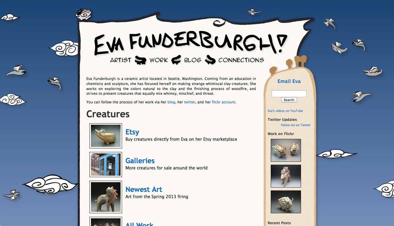
The previous version (shown above) was launched around 2008 and was basically just a Wordpress theme. Eva had hand-drawn some creatures and wiggly borders to make it all feel less digital, but there’s only so far you could go with that on a web page. The resulting site had a lot of character, but ultimately failed to put her gorgeous art front and center. Worse, it had failed to keep up with the increasing sophistication and complexity of her work. It also scaled poorly to mobile devices, and just plain looked outdated.
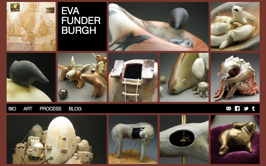
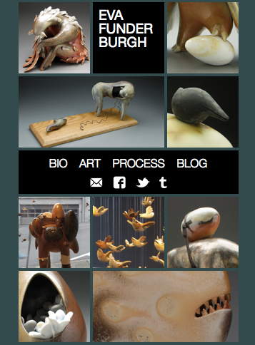
I had a lot of goals for the new site. First and foremost, it needed to be dominated by pictures of Eva’s art, especially on the homepage. The way I see it, any part of the screen that doesn’t include a picture of her sculptures is wasted space. I also wanted the design to be clean, contemporary, and focused. We have so many great pictures of her creatures that any ornamentation or empty space is a wasted opportunity. Beyond that, I had a bunch of technical goals befitting a website built in 2013. The first was that the site should work well on mobile, with a responsive design that supported everything from phones to tablets to widescreen desktop monitors. A related goal was that the site should support high-DPI or “retina” screens – both of us are eagerly awaiting new Retina MacBook Pros, and browsing with high-resolution phones and tablets is more and more popular. It seems safe to assume that screen resolutions will only increase over time, and I wanted Eva’s art to appear as sharp and beautiful as it could on nice devices. Also related to the goal to work on mobile, I wanted the site to be fast. This meant minimizing download size, number of external resources, and JavaScript computation. It also meant leveraging CSS transitions and animations to provide smooth, GPU-accelerated motion to give the site a nice feel. Helpfully, one of the decisions I made up front was that this site was going to target the latest browsers and the advanced CSS and JavaScript features they support. Fortunately, most browsers aggressively update themselves these days, so the age of supporting old browsers for years and years is coming to a close.
The site itself was built using Middleman, an open-source static website generator I help maintain. This allowed me to use CoffeeScript for all my JavaScript, which I have come to appreciate after a rocky first experience, and to use Haml and Sass/Compass for HTML and CSS respectively. One of my coworkers challenged me to write all my JavaScript without using jQuery, which was actually pretty straightforward and improved the performance of the site while dropping quite a bit of size from the overall download. I did rely on the indispensable Underscore for templating and utilities, however.
The redesign started with the new homepage, which presents a grid of cropped pictures that fill up the whole window. First, we chose a basic grid unit or “block” that the whole page is divided into. Eva selected a bunch of pictures she liked, and used Lightroom to crop them all into tiles of specific sizes, with dimensions of 1x1, 2x1, or 3x1 blocks. She also exported double-resolution versions of each block for retina displays. Each picture was associated with a full-frame version on Flickr. JavaScript on the homepage uses that information to randomly select images and las them down like a bricklayer would to make a wall, creating a solid grid of pictures. If the browser reports itself as high-DPI, the double-resolution images are used to provide retina sharpness. A quick CSS transition animates each block into the page as they load. To make the page responsive to different browser sizes, there are media-query breakpoints at each multiple of the block size and when the browser is resized, the blocks are laid out again. You can see the effect by resizing your browser – it will reduce the width of the grid one block at a time. Once the browser gets below a certain size, the block size is halved to fit more images onto a smaller screen. Using blocks for the breakpoints instead of the classic “iPhone, iPad, Desktop” breakpoints means that the design works nicely on many devices and browser window sizes – this way it looks good on devices from non-retina smartphones all the way up to HDTVs, and not just the Apple devices I happen to own.
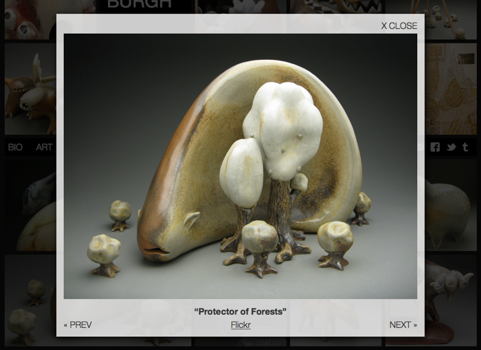
The other part of the homepage is the “lightbox” that appears when each tile is tapped. This is built from scratch rather than using any lightbox plugin, and uses CSS transitions to display smoothly. It also allows for keyboard navigation, so you can use the arrow keys to browse through pictures. The full-size image for the lightbox is linked directly from Flickr, and I use the Flickr API to select the perfect image size that won’t stretch and blur, but won’t waste time with a too-large download. This can end up showing a dramatically different sized image between a phone and a Retina Macbook!
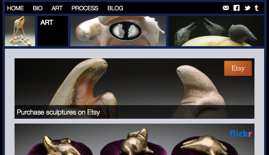
After the homepage, the rest of the site was relatively easy. For the most part, it’s still a Wordpress theme, though it reuses the responsive breakpoints at each integer multiple of the block size to provide nice reading on every screen. I also reused the exact same code from the homepage to provide a row of random tiles at the top of the page. Beyond that, there are just some SVG icons for the social media links (to ensure that they too display nicely on retina screens) and a few more subtle fit-and-polish tweaks to make it feel great. The “Art” page was designed by hand to provide high-resolution banners linking to Flickr, Etsy, and the various galleries that showcase Eva’s work, and the rest is editable directly from Wordpress so that Eva can maintain and update the content. A series of IFTTT rules make it easier for her to update the site while she’s working by piping specially-tagged Flickr uploads into the blog (and to Tumblr, Facebook, and Twitter).
I’m rarely satisfied with the website designs I produce, but this time I’m extremely proud of what we’ve built. Please check out the site, resize your browser, try it out on your phone, but most of all, enjoy the pretty pictures.
